What Your Color Palette Is Screaming About You (And You Didn't Even Know It Was Loud)
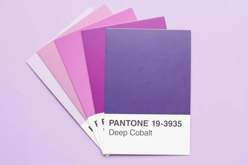
You didn't think too hard about it. You just knew you wanted your room in those particular shades — the dusty terracotta, the faded sage, the warm cream that isn't quite white. You picked them the way you pick a song when you're in a certain mood: not analytically, but instinctively, from somewhere below the level of language.
Here's the thing though: that instinct is not as random as it feels. Your color palette is, in the most literal sense, a message. It's communicating your values, your emotional landscape, your creative philosophy, and — whether you intended it or not — your tribal affiliation in the vast, complex social ecosystem of Gen Z aesthetics.
You are, my friend, fluent in a language you didn't know you were speaking.
Color Is Never Just Color
Let's establish something that color theorists and marketers have known for decades: color is one of the most emotionally loaded forms of non-verbal communication available to humans. Colors carry cultural associations, emotional valences, and psychological weight that operate largely beneath conscious awareness. You don't decide that a deep navy feels trustworthy or that a hot neon pink feels disruptive — you just feel it, because decades of cultural conditioning and basic human neurology have made it so.
But what's happening in Gen Z visual culture right now goes beyond basic color psychology. Specific palettes have become something closer to dialects — recognizable, community-specific, and loaded with meaning for those who know how to read them. Choosing a color palette isn't just an aesthetic decision. It's a statement of allegiance, an expression of values, and sometimes a very pointed rejection of whatever palette came before.
The Palette Dictionary (A Very Unofficial Guide)
Allow us to offer a completely unscientific but deeply felt translation of what your color choices are probably saying:
Muted Earth Tones (Terracotta, Sage, Warm Beige, Mushroom Brown)
The language of quiet intention. People who gravitate toward these palettes tend to be signaling a rejection of overstimulation — a preference for the analog, the handmade, the slow. There's a strong overlap with cottagecore, dark academia, and the general aesthetic of "I want to live in a library with a garden attached." The muted earth tone person is often deeply creative but allergic to chaos. Their aesthetic is a controlled exhale.
Personality translation: I compost. I have strong opinions about linen. I own at least one object with a mushroom on it.
Clashing Neons (Lime, Hot Pink, Electric Blue, Acid Yellow)
This palette is not asking for permission, and it would like you to know that. Clashing neons are a deliberate assault on the idea of "tasteful" — a rejection of the muted, the restrained, and the inoffensive. People who build their aesthetic around clashing neons are often making a political point about visibility, excess, and the right to take up space loudly. There's a strong lineage here running from 80s maximalism through Y2K revival to the current hyperpop aesthetic universe.
Personality translation: I have at least two things going on at all times. I am extremely online. I contain multitudes and would like everyone to know it.
Monochrome (Any Single Color, All the Way Down)
The monochrome person is playing a very different game. This is not minimalism exactly — it can be deeply maximalist in terms of quantity — but it's a game of depth rather than breadth. How many shades of blue can one person explore? Apparently: many. The monochrome aesthetic signals a certain obsessive quality, a willingness to go very far in one direction rather than a little way in many. It also signals confidence — this is someone who doesn't need variety to feel interesting.
Personality translation: I have a "thing." My thing is complete. I am at peace.
Duochrome (Two Colors, Maximum Drama)
Two colors, chosen for maximum contrast or maximum harmony, applied everywhere with conviction. This is the palette of someone who understands that constraint breeds creativity — that giving yourself fewer options forces you to do more interesting things with each one. Duochrome palettes feel graphic, intentional, and slightly theatrical. The person who lives here has strong opinions and isn't particularly interested in hedging them.
Personality translation: I make decisions quickly and I stand by them. I have a signature look. I am, frankly, a brand.
Faded Pastels and Vintage Washes
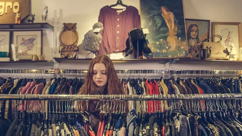
The aesthetic of nostalgia, but make it complicated. These palettes evoke a past that may or may not have existed — the sun-bleached, slightly melancholy color world of old photographs and forgotten summers. People drawn to faded pastels are often processing something through their aesthetic choices: a longing for simpler times, an appreciation for things that have aged gracefully, a comfort with impermanence. This palette has strong overlap with the "romanticizing your life" movement and the general Gen Z tendency to treat ordinary moments as deserving of beauty.
Personality translation: I feel things deeply and I have a film camera. I am nostalgic for things I never experienced. This is fine.
When Palettes Become Tribal Flags
Here's where it gets genuinely sociologically interesting. Within Gen Z's highly visual online culture, palettes have become shorthand — a way of instantly communicating aesthetic allegiance before a single word is spoken. Post a photo in a certain color temperature and certain communities will find you. Use a specific combination of tones in your feed and you are, whether consciously or not, raising a flag.
This tribalism operates with remarkable speed and precision. The moment a palette becomes strongly associated with a particular aesthetic community — the "dark academia" browns, the "coastal grandmother" blues and whites, the "goblincore" greens and golds — it starts functioning as a membership signal. You're not just choosing colors. You're choosing a community, a set of values, a way of moving through the world.
And when a palette gets oversaturated — when it appears on every Target product and every influencer's feed simultaneously — the original community often quietly abandons it, migrating to something new and less colonized. Palettes have lifecycles. They are born underground, go mainstream, and eventually become parody. The speed of this cycle has accelerated dramatically in the social media era.
So What Are Your Colors Saying?
Here's the invitation: look around at the colors you've actually chosen. Your room. Your wardrobe. Your phone case. Your saved images. The filter you always use. The mug you reach for every morning.
Is there a pattern? (There almost certainly is.)
What's it saying? What did you need those colors to do for you? What feeling were you chasing, or creating, or protecting?
Your palette is a self-portrait. It was always a self-portrait. You just painted it without quite realizing you were holding the brush.