Your Color Palette Is Showing: The Surprisingly Deep Emotional Life of Your Favorite Hues
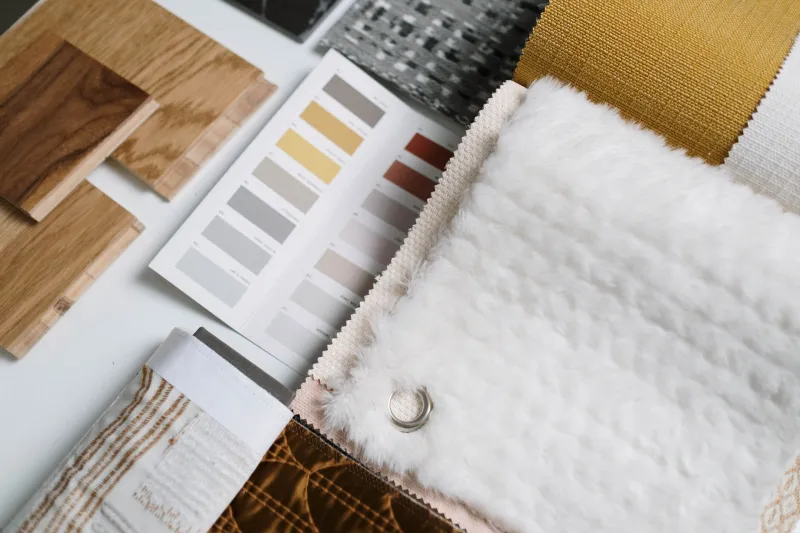
At some point in the last two years, a significant portion of young America started doing something that looks, from the outside, like a very calm form of losing one's mind. They began collecting colors. Not physically — though some of them are also doing that, with paint chips and fabric swatches and torn magazine pages — but digitally, emotionally, obsessively. Building what the internet has started calling personal color palettes: curated sets of four to eight colors that feel, to their collector, like a self-portrait.
Not a self-portrait of what they look like. A self-portrait of what they feel like.
This is color boarding, and it is quietly becoming one of the most interesting creative practices happening in America right now.
What Is a Personal Color Palette, Exactly?
The concept borrows loosely from design and brand identity work, where color palettes are used to establish mood, tone, and recognition. But personal color boarding strips away the commercial logic and replaces it with something stranger and more honest: the colors you are simply, inexplicably drawn to, regardless of whether they match, make sense, or would look good together in any conventional design context.
A personal palette might include a very specific dusty mauve, a particular shade of olive green that looks more brown than green, a washed-out coral that borders on salmon, and a deep almost-black navy. Or it might be a collection of colors that have no obvious relationship — a hot neon yellow sitting next to a muted sage, a terracotta next to a steel blue.
The "wrongness" of certain combinations is often the point. More on that in a moment.
People build these palettes in Canva, in Adobe Color, in Procreate, in handwritten paint swatches in notebooks. They pin them to Pinterest boards labeled things like "my brain" or "me but make it visual" or simply "this." They use them to guide outfit choices, room decor, what color pens they buy, which Spotify playlist cover they make.
The palette becomes a lens through which they make a hundred small daily decisions. A quiet, ongoing act of self-definition.
The Psychology of Color Is Weirder Than You Think
Color psychology is a real field and also a slightly chaotic one. The basics — blue is calming, red is energizing, yellow is cheerful — are well-documented enough that every corporate waiting room in America has been painted a specific shade of beige based on focus group data.
But the more interesting research is at the edges of the field: the work on personal color associations, on how individual experience shapes color response, on why the same shade of green can feel peaceful to one person and deeply unsettling to another.
Your emotional relationship with a color is, in large part, autobiographical. It's built from every room you've been in, every object you've loved, every memory that happened to have a particular color in the background. The dusty rose that makes you feel safe might be the color of your grandmother's kitchen. The specific shade of blue that makes you feel melancholy might be the color of a car window on a long drive during a hard year.
When young people build personal palettes, they're not just picking pretty colors. They're excavating their own emotional histories and arranging them into something they can look at.
"I spent like three hours one night just building my palette in Canva," says Amara, 23, from Atlanta. "And when I was done I was kind of shaken, honestly. Because it looked like me. Like, it looked like the inside of my brain in a way that I couldn't have described in words."
The Rise of Color Boarding as Meditation
For a lot of practitioners, the process of building a palette is as meaningful as the result. Searching for colors — scrolling through hex codes, testing combinations, pulling swatches from photographs — is described in almost meditative terms. It requires attention without pressure. It produces something without demanding anything specific.
It's also, notably, a creative practice that has essentially no failure state. You cannot build a wrong palette. There is no skill threshold to clear. The only qualification is that the colors feel true to you, which means the practice is accessible to people who don't consider themselves artists, don't have formal creative training, and have been told their whole lives that they're not visual thinkers.
That accessibility matters. It's part of why color boarding has spread so far beyond design communities — it's become a tool for emotional processing that doesn't require any artistic vocabulary beyond yes, this and no, not that.
Therapists have started noticing. Some practitioners in art therapy contexts are incorporating personal palette work as a way of helping clients externalize emotional states that are hard to articulate verbally. The palette becomes a conversation starter. A way in.
When 'Wrong' Colors Feel the Most Right
Here's where it gets genuinely interesting: the most emotionally resonant palettes are often the ones that break conventional color rules most dramatically.
Design education teaches color harmony — complementary colors, analogous colors, the triadic relationships that produce visually balanced results. These rules exist for good reasons and produce reliably pleasing outcomes.
Personal color boarding frequently ignores all of them, and the results are often more interesting.
The combination of mustard yellow and dusty lavender shouldn't work on paper. Neither should rust orange with forest green, or hot pink with brown. But these combinations keep appearing in personal palettes, and when you ask people why, they say things like: it feels like autumn and anxiety at the same time, or it's how I feel when I'm happy but also kind of sad, or simply it's the only combination that feels completely honest.
The "wrong" palette is honest because it doesn't perform harmony it doesn't feel. It sits in the tension between colors that shouldn't coexist and says: I contain multitudes, and they don't always get along, and that's fine.
There's something quietly radical about that. In a visual culture obsessed with curated coherence — the matching aesthetic, the consistent feed, the on-brand color story — choosing colors that fight each other a little is an act of creative honesty.
Building Your Own
If you want to start (and you probably do now, because this is how it works), here's the low-pressure entry point: spend a week screenshotting colors that stop you. The specific green of a houseplant in afternoon light. The color of your favorite thrifted sweater. A paint chip at the hardware store that you don't need but can't stop thinking about.
At the end of the week, pull them together and look at what you've collected. Notice what they have in common — the temperature, the saturation, the mood. Notice what's surprising. Notice what feels like you.
That collection is the beginning of something. A visual vocabulary. A self-portrait in progress.
It won't tell you everything about yourself. But it'll tell you something your therapist might spend three sessions getting to, and it'll look really good in a Canva document while it does it.